A brand logo is like a visual asset that is maintained by a company for defining its product’s identity. It’s a way of communication between a brand and its loyal consumers. And, with so many brands thriving on the success of their logo, it is the logo designers who have to play a major role. Although the task is not as simple as it seems, many big brands have undergone major logo redesign to be in the game.
While some have a dedicated team of in-house graphic designers, there are others who prefer approaching marketing agencies to bring about the change. It is interesting to note that many big brands like McDonald’s and Baskin-Robbins have undergone logo redesigns not just once or twice but multiple times, to make a mark.
According to a 2020 report by branding agency, Inkbot Design, it is indeed essential to work on logo redesign or rebranding whenever required as doing that helps boost sales.
Some of the big brands that changed logos over the years
Burger King
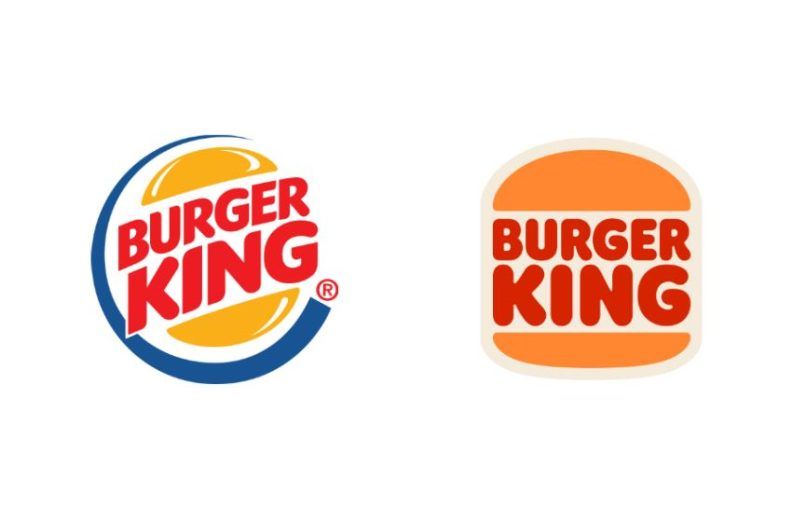
A major burger chain based out of Miami, Burger King officially changed its decades-old logo on 7 January 2021. The logo redesign was helmed by Jones Knowles Ritchie, an independent creative agency. This updated logo features the words ‘Burger King’ in bold red Flame Sans font, embedded between two bun halves. It was influenced by the 1969 and 1994 classic Burger King logo.
The new version’s primary colours are the same as the old one and include light brown, red and orange, with the blue colour being eliminated. According to its designer Lisa Smith (executive creative director at Jones Knowles Ritchie), “The new logo pays homage to the brand’s heritage with a refined design that’s confident, simple and fun,” as reported by Dezeen.
Meta
Mark Zuckerberg’s company, Meta Platforms (known as Facebook Inc. previously), was rebranded recently. Along with the logo having an infinity symbol, the company’s name was changed to Meta, referring to the metaverse. However, the new design maintains the brand’s colours. Additionally, all its apps including Facebook, WhatsApp, Instagram and Messenger, adopted the logo (coupled with their own logo), which was built in the company’s recognisable 2019 typeface.
The name symbolises its expansion into a virtual environment where users can have parallel lives. In a letter posted on the company’s blog, Zuckerberg said, “For me, it symbolises that there is always more to build, and there is always a next chapter to the story.” The Greek word Meta means ‘beyond’ in English.
Apple
Before it became a successful luxury brand, Apple had a long history of changing its logo several times. When Apple was launched in 1976, its first brand logo, as designed by Ronald Wayne, featured Newton reading a book under a tree.
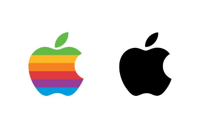
Later, in 1977, Steve Jobs altered the logo to highlight a new computer design, and for this, he teamed up with seasoned logo designer Rob Janoff. The logo created by Janoff was a rainbow-striped partially-eaten apple with ‘Apple’ written next to it.
Further, in 1984, at the time of Macintosh’s debut, a brand management company named Landor Associates changed the logo slightly by removing the name ‘Apple’ from it. Later, this logo was reworked to an apple without strips and in black colour.
Finally, Apple developed its well-known glass-themed logo in 2007, followed by a flat and simpler version much later, which is currently in use.
Baskin-Robbins
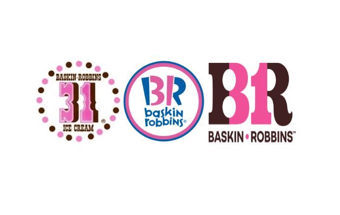
In 2022, the American multinational ice cream chain Baskin-Robbins, changed its logo yet again. It reflects significant font and colour changes while keeping the number ‘31’ intact on the letters BR. Initially, the number ‘31’ represented a new flavour of ice cream for each day of the month, however, the brand has over 1,400 flavours now. Seal Brown and Rose Bonbon are two colours which the newest logo features with the typeface being bold Sans Serif.
As per an official release, the vice president of Marketing and Culinary at Baskin-Robbins, Jerid Grandinetti was quoted saying, “Our new look and manifesto recognize the extraordinary role ice cream has played in our customers’ lives, along with our continued commitment to innovation and creating someone’s next favourite flavour.”
This ice cream giant, too, has changed its logo multiple times. When the logo was changed in 2006, the classic BR was retained with the addition of Baskin-Robbins in wavy font style in bright pink and blue hues, followed by a darker version in 2020. It was further changed to what it is today.
Wondering what the original Baskin-Robbins logo looked like? Back in 1947, it looked considerably different. Previously, the number 31 was encircled, while Baskin-Robbins was written below it in brown colour, which was changed to Baskin and Robins written on either side of the number 31 in the year 1991.
Nokia
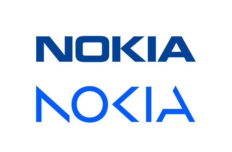
Nokia is another big brand that recently redesigned its long-standing emblem to redefine its brand identification. Developing a new logo based on the use case (depending on the background on which it is used), the previous logo’s font style has been replaced.
Addressing this change, Nokia CEO Pekka Lundmark said, “We want to launch a new brand that is focusing very much on the networks and industrial digitalization, which is a completely different thing from the legacy mobile phones,” in an interview with Bloomberg.
The company’s classic previous logo included the brand name written in a Sans-Serif font with the letter O looking more like a square with rounded sides. It had a white background and a vibrant blue colour palette and was in use from 1978 to 2023.
Starbucks
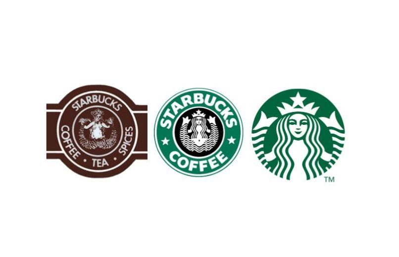
The favourite coffee house of most people, Starbucks has such a distinctive green and white logo that it is synonymous with the brand name now. But, Starbucks’ renowned logo was changed two times before the iconic logo was formed.
The striking image of a siren in the initial 1971 design was encircled in a ring that read ‘Starbucks — Coffee, Tea and Spices’, emphasising the primary goods offered at the business’ first coffee shop. The logo underwent a big update in 1987, with green, white and black hues being used, which was changed from brown and white.
Finally in 2011, on its 40th anniversary, Starbucks updated its logo and removed all the words keeping just the Siren, in the green and white colour scheme. Regarding the new logo, its website reads, “What’s notably absent from our current logo? Our name. Starbucks global reach extends beyond the bounds of coffee, and our Siren, now so familiar, can surely stand on her own.”
Visa
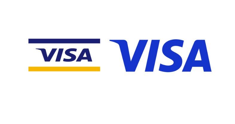
Another well-known brand that has changed its yellow and blue logo multiple times since its inception in 1958, is the American payment service provider Visa. The company’s initial logo was a rectangle with circular sides with the wordmark ‘BankAmericard’ sandwiched between blue and yellow coloured rectangular borders.
Later, the company changed its brand name to Visa to gain global recognition. This called for a new logo too, so one with the wordmark ‘Visa’ placed between two blue and yellow coloured rectangle borders was created. But in 2014, the company took away the golden colour.
Lastly, Visa launched its new look with creative agency Wieden+Kennedy’s assistance after undergoing multiple changes over the years.
Walmart
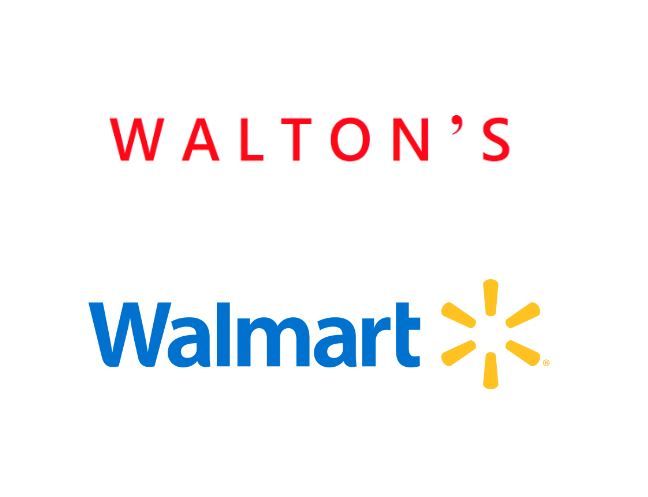
Walmart, the USA-based chain of hypermarkets and discount stores, introduced a spark symbol to its existing logo in 2008. A softer, rounded typeface has been used in a blue and yellow colour scheme, replacing the heavy geometric one.
Before designing the current brand logo, the company had around 12 different versions that were all modified over the course of time However, the company’s original logo from 1950, which featured the name ‘Walton’s’ in red capital letters and Sans-Serif type as the company was founded by Sam Walton, is the most distinctive of all.
Nike
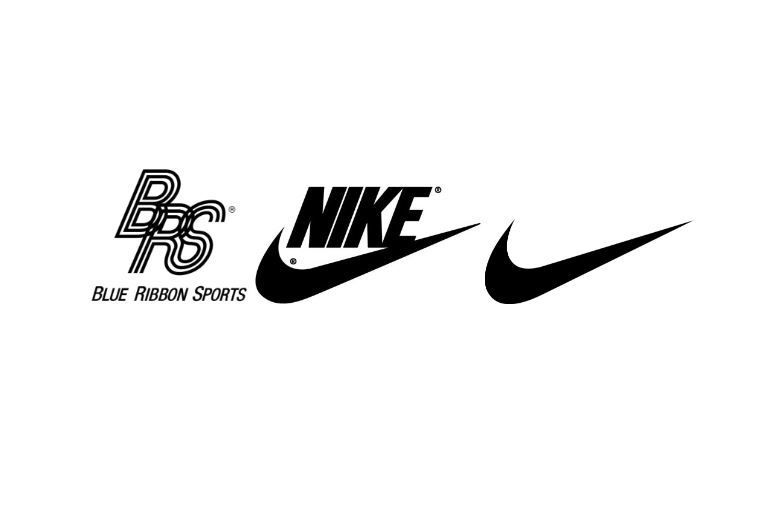
One of the most-loved sneakers and sports equipment companies, Nike, too, has a long history of logo redesigns and rebranding. The initial name of the company, Blue Ribbon Sports, was on its first logo with the letters BRS entangled with each other.
But in 1971, the logo was redesigned by Carolyn Davidson, a designer who worked on the distinctive swoosh which underwent a series of alterations over time to finally look what it is today.
McDonald’s
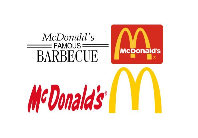
The brand identity of one of the biggest restaurant franchises in the world, McDonald’s, was not always the same. The initial symbol of the company consisted of a black wordmark that was done in three different styles and levels with the word McDonald’s inscribed in a classy, conventional italicised Serif font, including the words ‘Famous Barbecue.’
But when hamburgers were becoming more popular around 1948 in the States, the word barbeque was removed and ‘hamburgers’ was added. And in 1961, the modern-day golden arch symbol in the form of ‘M’ was created by Stanley Meston, however, it looked very different from how it looks today.
After several changes to the ‘M,’ in 2018, the visual identity was altered again. This time the red rectangle with rounded corners included the arch ‘M’ and the words ‘McDonald’s’ in white text got removed. This emblem is still used by the company and is possibly the most iconic of all the fast-food franchise logos.
Adidas
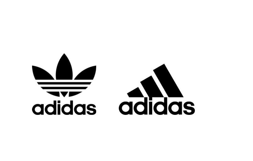
The German sports manufacturing company’s tale of logo rebranding is the most interesting one. The company’s first logo included a spiked track and field shoe, with the iconic 3-Stripes, between the two d’s of Adidas.
When Adidas expanded its business by going beyond shoes, the Trefoil was created. But, in order to maintain Adidas’ reputation as the company with the three stripes, the new logo had three foils that were shaped like leaves which had the 3-Stripes running through them.
Finally, in 1989, the well-known Adidas logo was designed with the idea of their dedication to providing players with the best equipment. This logo was created by drawing the renowned three stripes as they appear when viewed from inside an Adidas shoe, as per its official website.
Since no specific colour scheme is associated with the Adidas logo, Adidas is allowed to change the logo’s colour as they deem appropriate to go with the style of the garments on which it is being put.
(Main and featured image credit: Starbucks; SVG from original logo and Baskin-Robbins/ Public domain via Wikimedia Commons)

